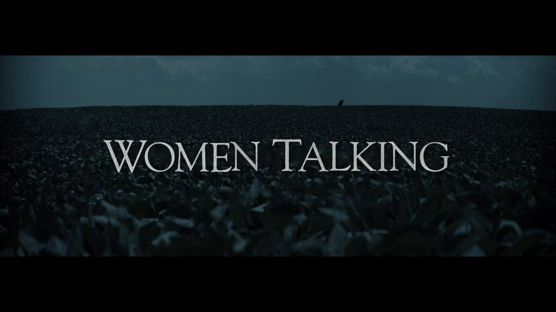
Women Talking
motion graphics // theatrical
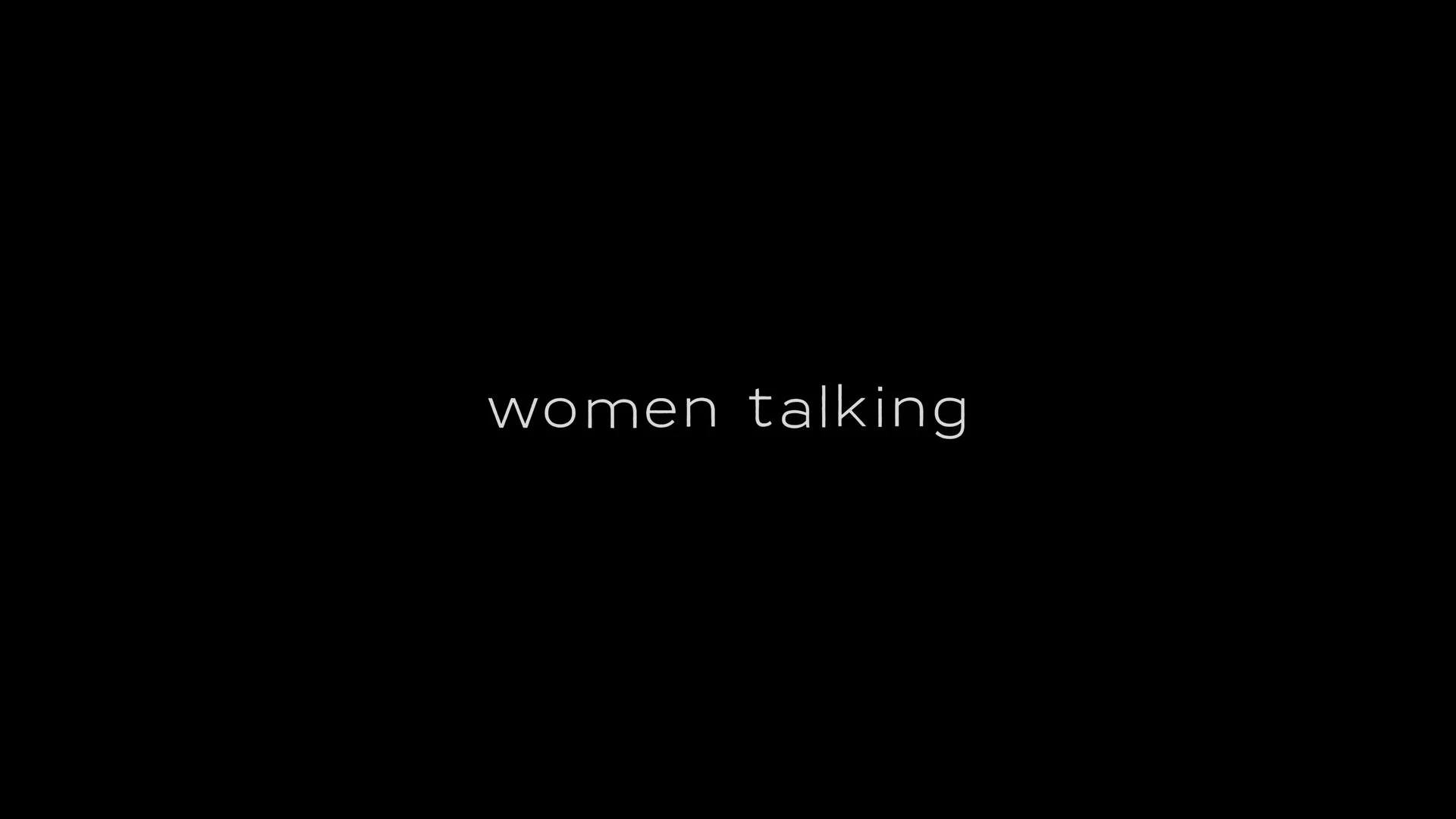
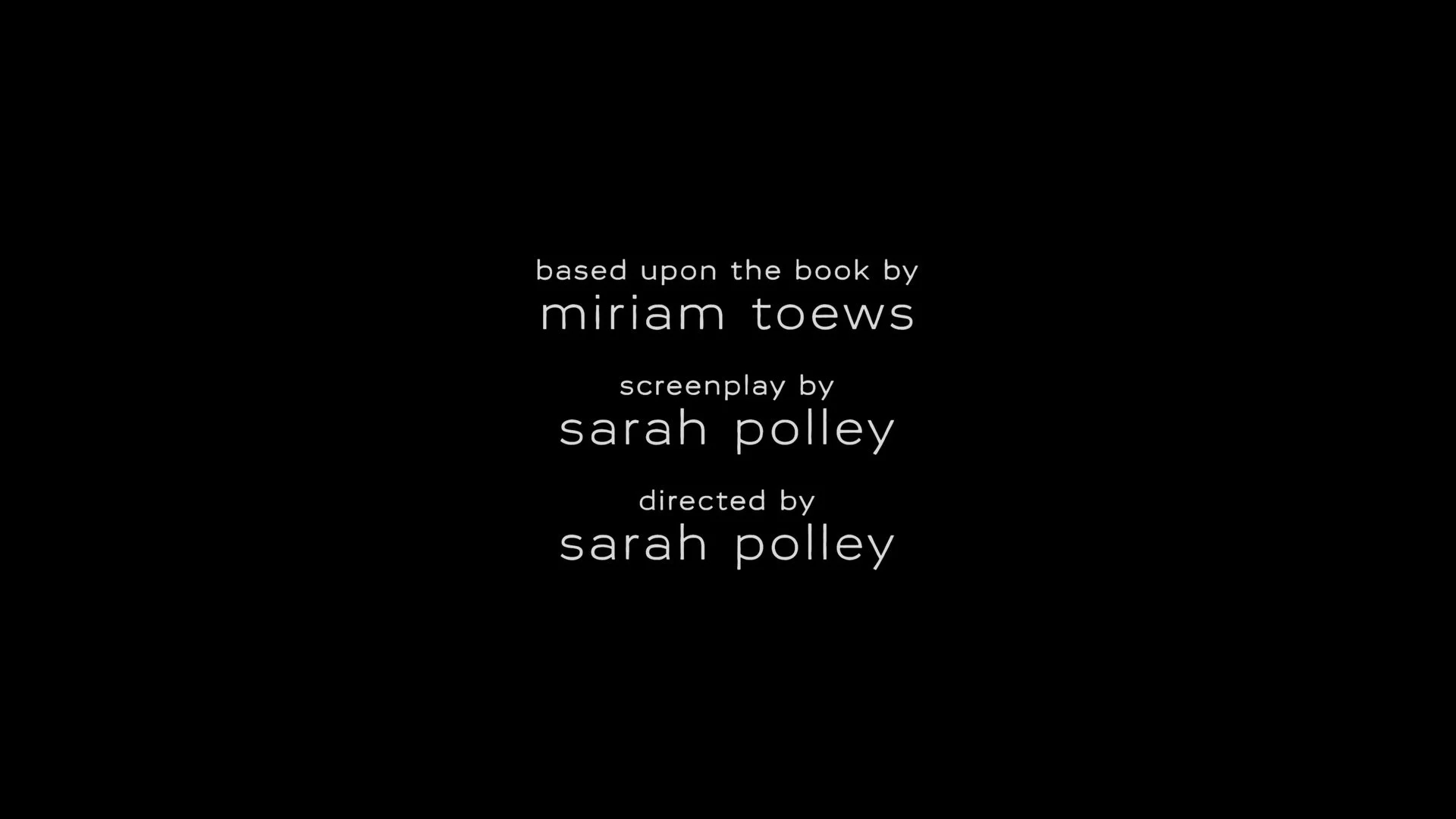
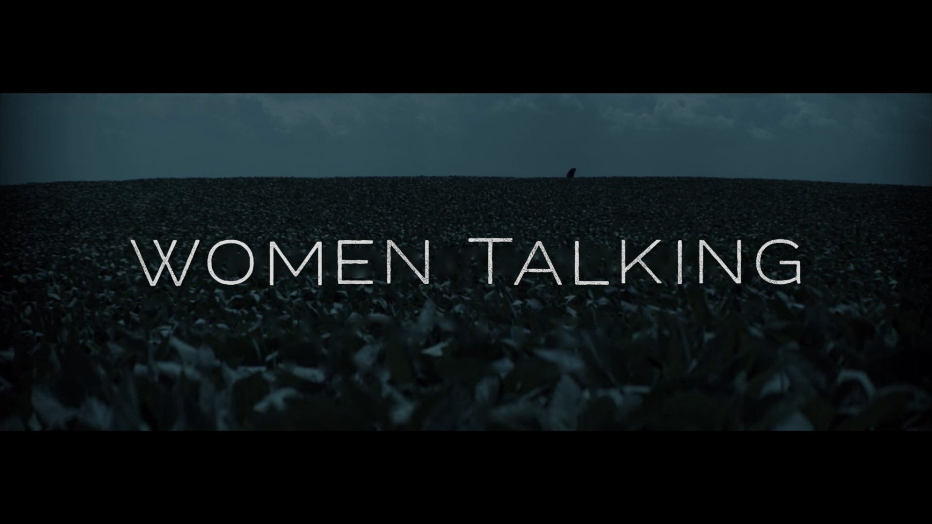
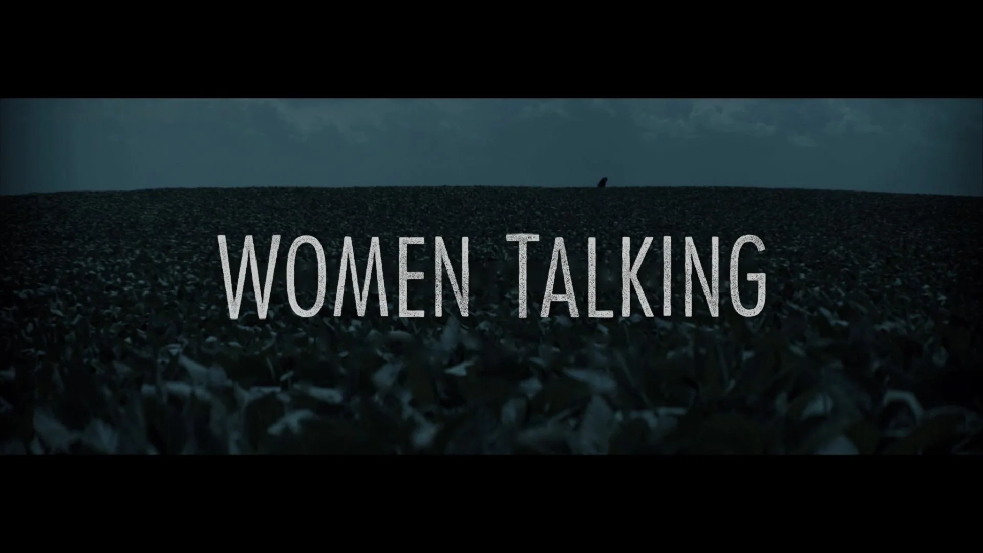
This project began a bit more stylized — my initial idea was to create something in the letterpress tradition with a wooden texture and more uneven character placement. After a few rounds of development, we lost the texture in favor of white, and we generally made the graphics quieter. This film is dense in dialogue yet also relies heavily on silence; the graphics in that respect should also be understated. The final title design uses lowercase Vito Extended Light and retains a subtle amount of letter offsetting. Below you can find other cards from the trailer.
Below are selected samples of the initial letterpress exploration.
Below is the trailer I worked on.
Official Trailer “Unknown”
