Little Richard
motion graphics // theatrical
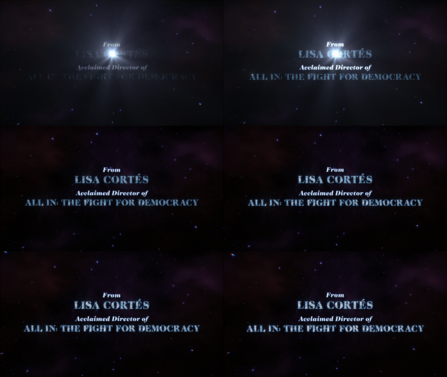
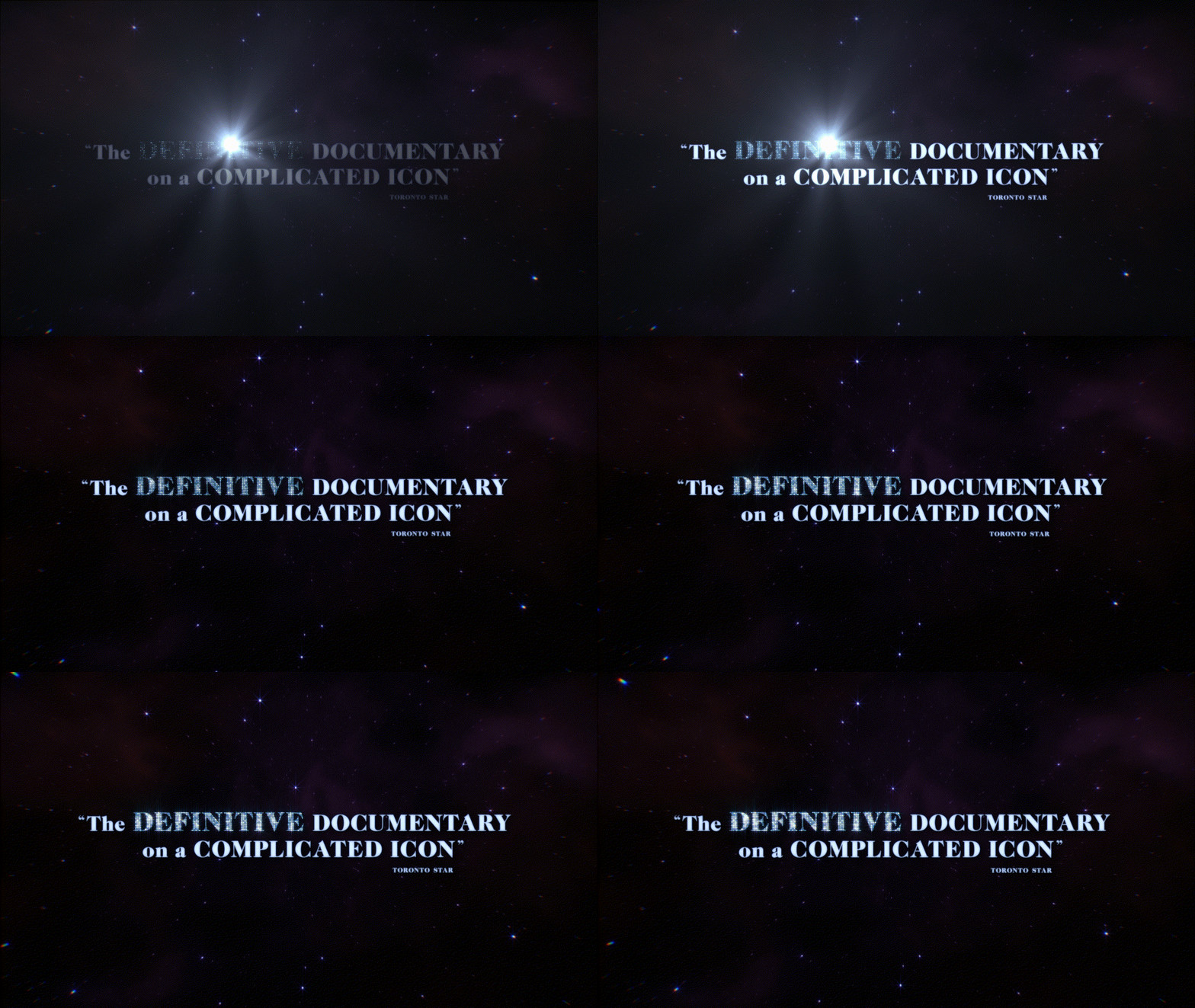
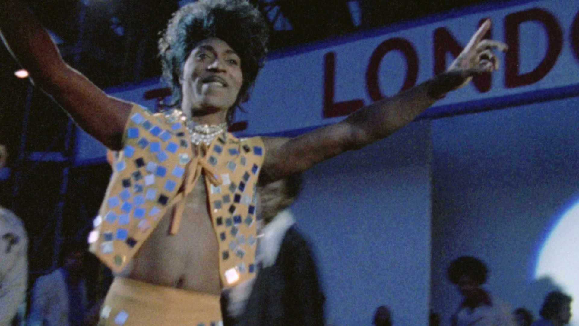
The direction for this design was to make the documentary feel like a rock concert. The light-up effect on the text initially began as replicating a marquee light bulb sign, but as I continued to tinker with the edges of the letterforms as well as the scale of the lights, I ended up closer to the texture of a disco ball. That effect was made using the plugins Stardust and Optical Flares. The nebula backplate was inspired by the film’s celestial motifs on this larger-than-life star. The title lockup itself is similar to the feature in its stacking and emphasis. I used Caslon FS because as a modern interpretation of an old-style typeface, I find it very versatile when it comes to creating elegant nostalgia.
Official Trailer “King”


